

Nuit Blanche
Overview
This poster serves as a public service announcement (PSA) promoting seatbelt awareness.
Goal: Create a public safety poster that communicates the importance of wearing a seatbelt to young adults and children in a heroic, comic-themed way.
Role: Branding & Graphic Designer (solo project).
Project type: Branding & Graphic Design.
Tools: Illustrator, Photoshop, InDesign, Adobe Express, and
After Effects.
Challenge
The challenge of this poster was to design something that would capture the interest of both young adults and children, especially males, since statistics show that this demographic is less likely to wear a seatbelt. The poster also needed to communicate its message clearly without losing its bold, illustrative, comic-inspired aesthetic, while also incorporating some physical components into the design.


Strategy
My approach to this project was straightforward. I began with research, then developed concepts and ideas for the poster, selected the strongest direction, and refined it further.
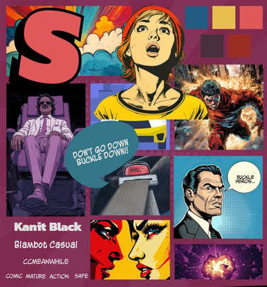
Moodboard
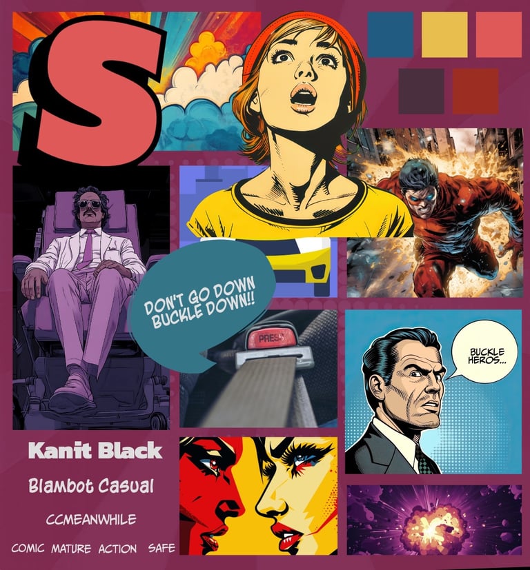
I created a mood board featuring darker tones and more mature illustrations to better align with the preferences of the target audience, particularly males aged 18–24, while still appealing to younger viewers. Initially, my mood board consisted of more vibrant colours.
Sketches
I created sketches of various concepts and approaches for my poster, all of which explored a comic book theme and encouraged viewers to wear their seat belts.


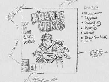

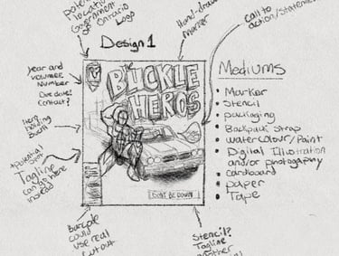

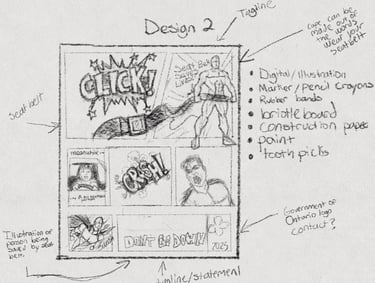

From Paper To Digital
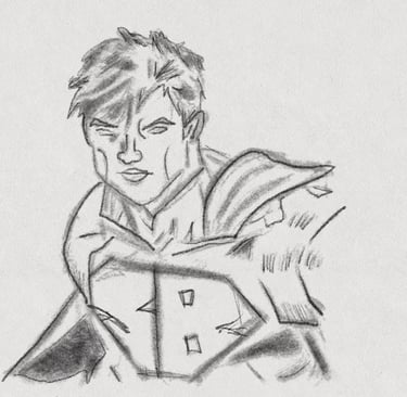
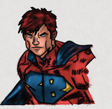
After selecting the ideal layout I wanted, I sketched the hero on paper. Afterward, I took a picture of my drawing and digitally redid the colours in Procreate. Once I finished recolouring in Procreate, I removed the white background using Photoshop.


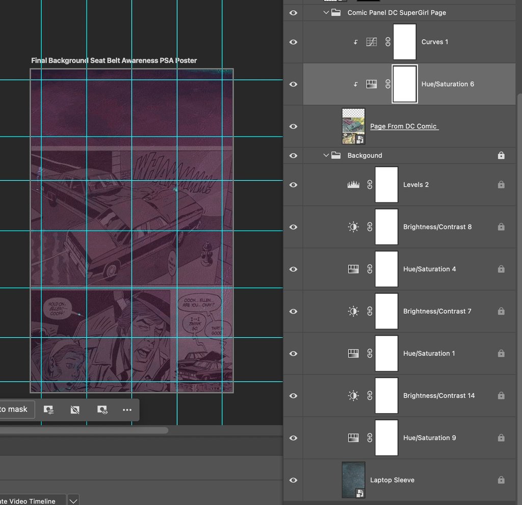
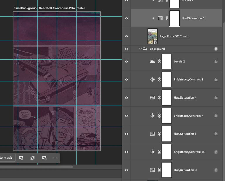
Next was gathering the materials for my background. For a digital component, I incorporated a page from DC's Supergirl comic. DC has produced numerous seatbelt PSAs, so I thought it would be great to subtly include this in my poster background. All of the elements were combined and further enhanced with Photoshop.
Poster Iterations
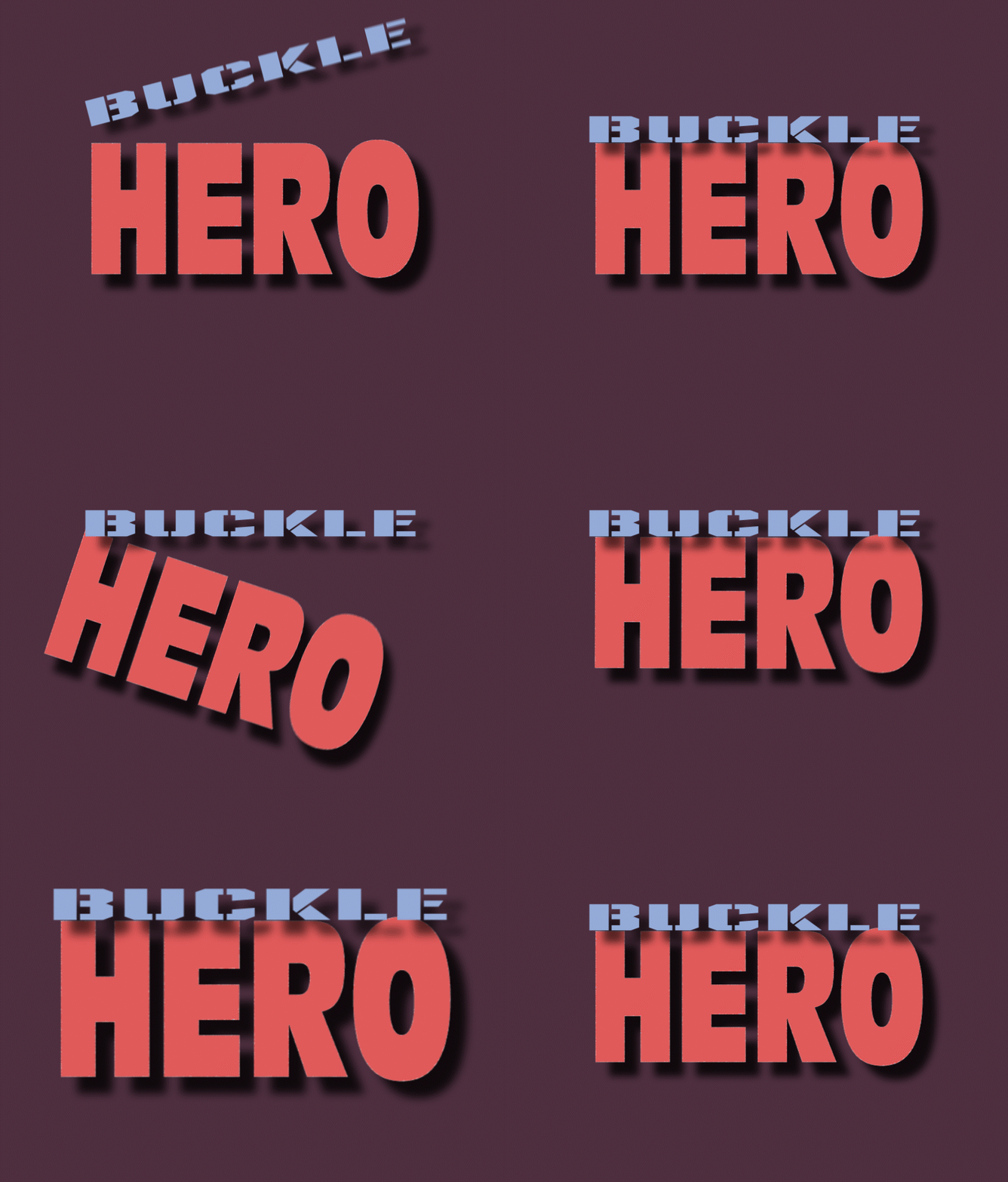
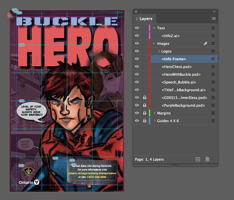
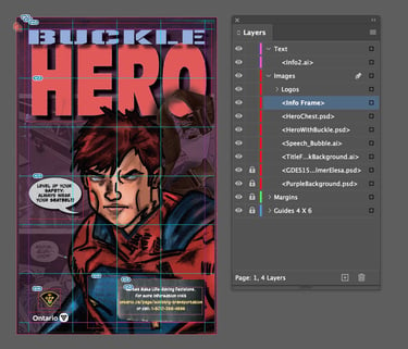
I then created a digital version of my chosen poster direction and experimented with different iterations.


Final Version
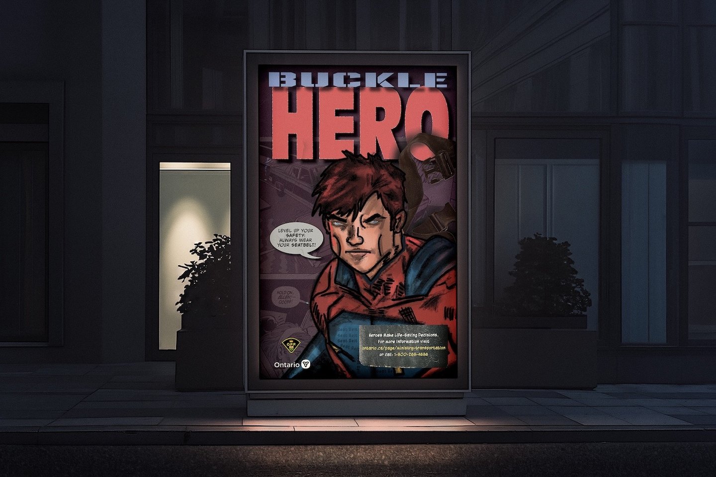
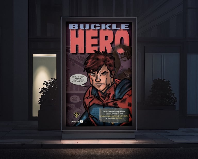
Finally, I made further refinements and created the final mockup by putting everything together with InDesign.
Key Takeaways
This was a fun but challenging project. One of the greatest difficulties was determining the most effective medium to use. I constantly questioned whether I could achieve my vision using the materials available to me. Overall, once I re-evaluated what I wanted to do and who I was designing for, the poster started to come together.
I learned to be more strategic in balancing the hierarchy between typography and illustrative elements so the message remains clear. I also learned that experimenting with different layout styles is okay and helpful for narrowing down the best location for elements that improve readability and communicate my goal.
View Other Projects


Back To Top
ELESA PALMER © 2026