

City Marks


Overview
City Marks is my idea of an archive and community exploring graffiti art and culture across cities worldwide. It is a brand audiences can trust to understand the context and details behind street art in major cities, while also highlighting popular graffiti art around the city.
Goal: The objective for this project was to focus first on the city of Toronto and create the visual identity for the brand as well as wireframes and prototypes. The created immersive experience should help users learn fin about graffiti, connect with others, and share their own work.
Role: Graphic Designer (solo project).
Project type: : User Experience & User Interface Design (UX/UI), Branding, Graphic Design.
Tools: Illustrator, Photoshop, InDesign, and After Effects.
Challenge
The challenge for this project was to create a brand that conveys an immersive, bold, expressive, and urban tone while staying authentic to graffiti culture. I also aimed to create a visual experience that reflects the brand appropriately and remains visually engaging as a whole.


Strategy
My approach to this project was divided into two main phases: the first focused on developing the visual identity, and the second on creating a high-fidelity prototype to illustrate the concept and apply the brand guidelines. Each stage was further broken down into tasks such as research, SWOT analysis, competitor analysis, user interviews, Brand direction, mood boards, site maps, mockups and logo design.


SWOT
One of the first steps in this project was conducting research , specificaly. conducting a SWOT analysis of the brand, to look closely at where it currently stands in the market and identifying gaps I could fill.
Sketches
I created sketches of various logo and wireframe concepts that explored a graffiti-inspired urban theme while ensuring the necessary features were considered. I applied the same approach to the logo, which needed to stay true to the brand’s graffiti-like style.


Wireframes
Wireframes came next, following my sketches, and were used to develop the low-fidelity prototype with simple transitions.


High-Fi Prototype
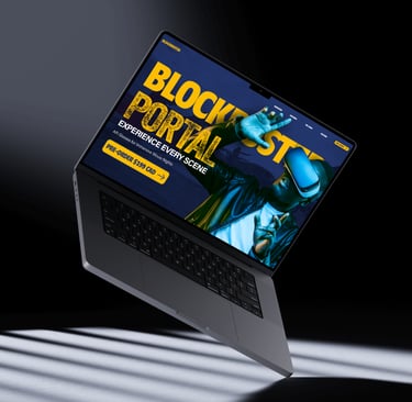
Next, I transformed the low-fidelity prototype into a high-fidelity prototype. At this stage, it was important to make sure the brand’s visual style was reflected throughout the design and that all imagery and video-related content was edited carefully so I could capture the essence of the project. Ultimately, this led to the final high-fidelity prototype created in Figma.
Key Takeaways
This was a fun project but the process did become challenging. One of the main difficulties I faced was managing my time while still trying to achieve exactly what I wanted. I spent so much time trying to perfect certain details, and started overanalyzing things. However with further refinement and usability testing It can be even more better.
View Other Projects


Back To Top
ELESA PALMER © 2026