

Hydra X Smart Bottle
Overview
For this project, I created a smart water bottle brand (Hydra X) and developed interactive prototypes based on research.
Goal: The goal of this project was to create an innovative yet engaging smart hydration product, along with its branding, some marketing materials, and the digital experience for the product.
Role: Graphic Designer (solo project)
Project type: User Experience & User Interface Design (UX/UI), Branding, Graphic Design.
Tools: Figma, Illustrator, Photoshop, Adobe Express, After Effects.
Challenge
For this project, the challenge was to design a research-backed digital experience that would appeal to a wide range of people and be easy to navigate. It needed to be clear and adhere to the established brand identity to ensure uniformity. The same applies to any branding materials and promotional graphics that were to be created.



Strategy
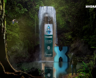
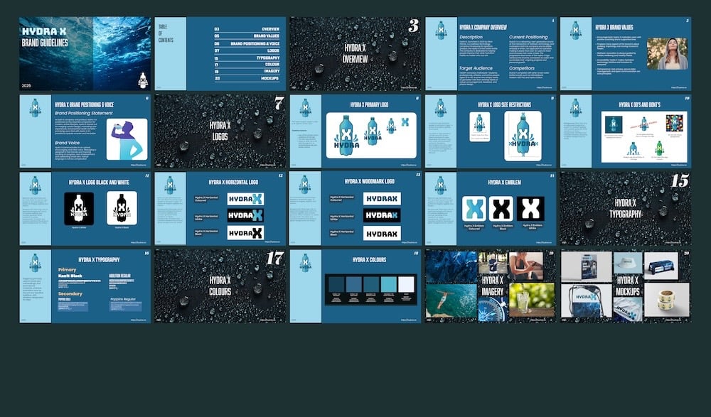
I approached this project as if I were really developing the Hydra X Smart Bottle and its brand. I utilized bold typography, blue tones, and research to design something that reflects smart hydration.
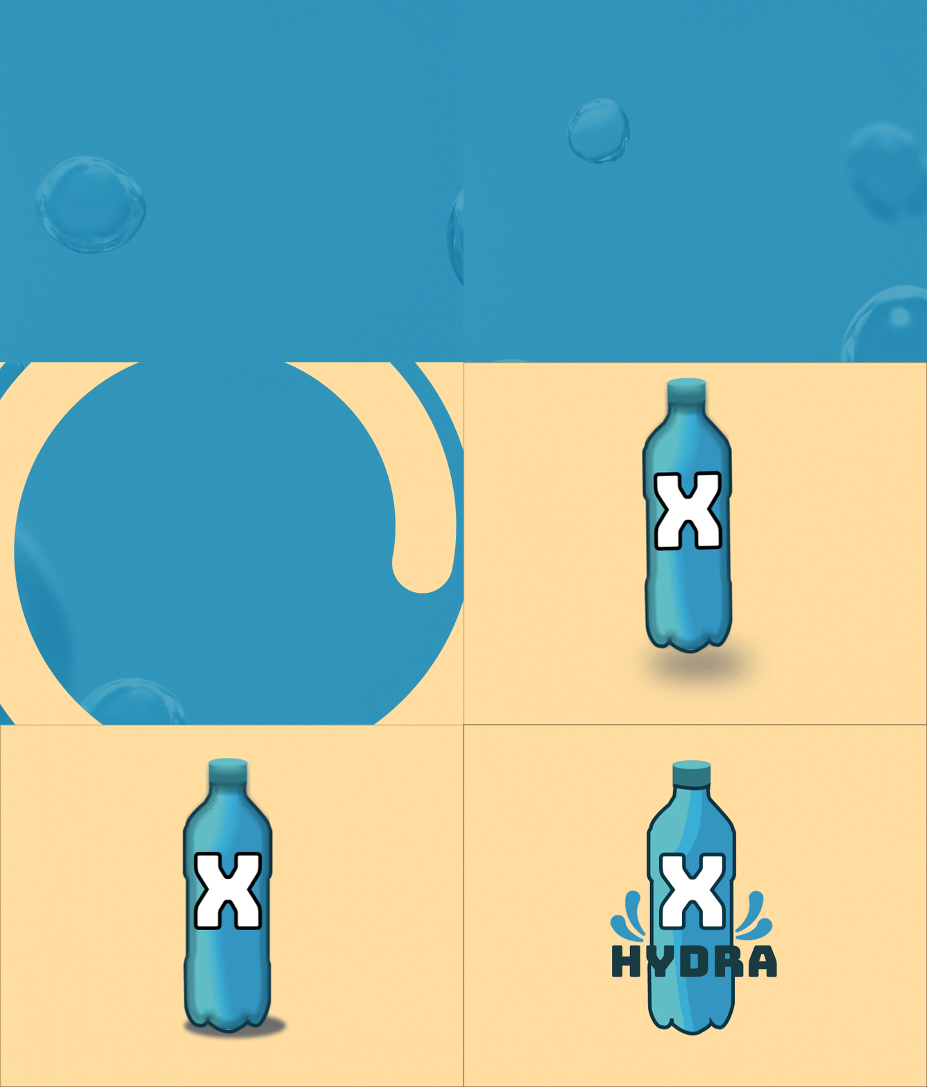
I started by researching why a smart bottle would be a good idea and by understanding the current market. I then designed and created the brand identity for Hydra X, a brand built on encouragement, progress, and a sense of fun.

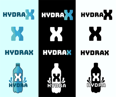
Logo Explained
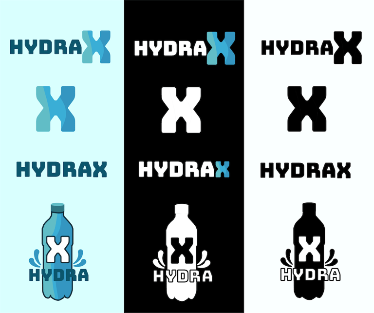
Its dynamic blue tones not only reference water but also symbolize a journey of personal growth and improvement—echoing Hydra X's core mission: to help users become their best selves. By blending wellness with technology in a unique and approachable way,
Journey Maps
Now, with an understanding of the brand, I used my research to create personas and customer journey maps to identify potential solutions to the target audience's pain points and any additional features the bottle could include.
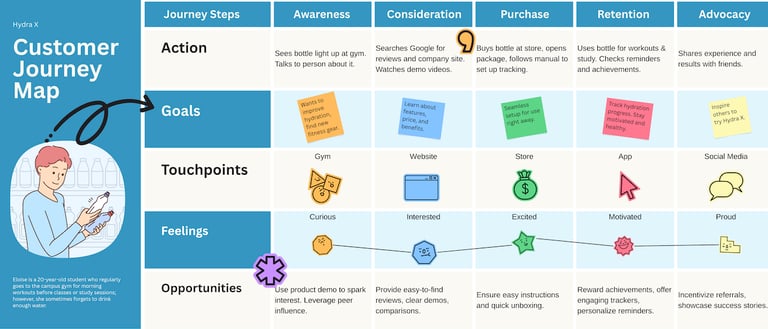

Personas & User Flow
To help visualize the user's flow in completing the specified task, creating a user flow proved useful. Additionally, making sketches helped me see the direction I wanted to take in designing the interface.
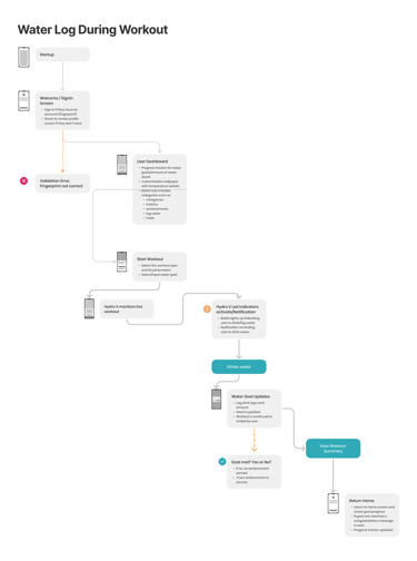
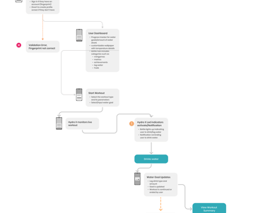


Wireframes, Low-Fi Prototype & Testing
Next came creating the wireframes, followed by the low-fidelity prototype and some user testing. Testing for the low-fi Prototype was informal, where my peers were instructed to complete the task of finishing a workout and logging their water intake. After completing the task, they were free to explore the Prototype and provide any feedback they had. Finally, I used the test findings to adjust the Prototype and create the high-fidelity version.

High Fi Protoype
Minor changes were implemented to better align with the brand and take into account feedback from my peers. This includes the use of brand colours, typography, and the Hydra X logo. In consideration of accessibility concerns, I designed the wireframes in accordance with mobile device standards. I also put forth my best effort to create smoother transitions for the high-fidelity prototype.

Key Interface Changes
The hi-fi version of the home screen included a notification bar positioned just above the menu items. This was added to simplify the user experience, allowing them to see key information about their water intake quickly when needed. Initially, the "Welcome" was at the top; however, I’ve moved it below the logo to establish a clearer hierarchy, as the logo should be seen first by the user to improve awareness. Not much has changed in terms of development here; however, there is more implementation of brand typography and colours. Incorporated in the final design is the actual percentage of completion for the user's goal


Key Takeaways
Overall, I really enjoyed this project. To further enhance it, I could conduct more formal usability testing on my high-fidelity prototype. Additionally, I could add more features and pages to support a wider range of tasks. This project also helped me deepen my understanding of User Experience Design and the various methods involved in product design, from conception to iteration.
Of course, these methods are not just done for the sake of it; they have a direct purpose that helps meet design goals and ultimately leads to the best possible product for users.
View Other Projects

Back To Top
ELESA PALMER © 2026